
Every image that you upload to your website should be optimized for web. In this blog post we’re going to explain how to optimize and size images for your website correctly, and why it’s important that you do this.
Terminology
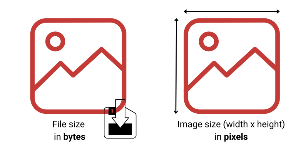
One of the stumbling blocks when it comes to optimizing and sizing images correctly is confusion over the terminology. File size versus image size, pixels versus bytes, not to mention resolution, DPI/PPI and display size! So, before we go any further, let’s try and define some of these terms.
File Size
When we talk about file size, we mean the size of the file in bytes.
File size is a measure of how much data a computer file contains or, alternately, how much storage it consumes. Typically, file size is expressed in units of measurement based on the byte.
Wikipedia
File sizes are measured in Bytes (B), Kilobytes (KB), Megabytes (MB), Gigabytes (GB), Terabytes (TB) and so on.
Image Size
When we talk about image size, we mean the dimensions of the image in pixels.
Image Size is the term given to describe the height and width of an image in pixels. Maximum Image Size is determined by the megapixels of a given camera – for example, a 10-megapixel camera will give a maximum image size of 2592 by 3872 pixels.
Canon
Display Size
How an image displays on a webpage is not necessarily determined by the image size. It is determined by the location of that image on the page, how we have chosen to display it, and the screen size.
When you upload an image to your website, your website builder will create several versions of that image. For example, WordPress will create a thumbnail version (150px wide), a medium version (300px wide) and a large version (1024px wide). The original image size that you upload is the ‘full size’ version. Squarespace creates up to seven versions of your image.
So, your original image size might be 1200×1200 pixels, but you have chosen to place it in a 3-column grid. For a typical desktop screen size, it is likely displaying a 300×300 pixel image. The original uploaded image size is still 1200×1200 pixels, but what we see on screen isn’t (and your website builder will have resized as necessary).

DPI/PPI
What do DPI and PPI actually mean, and are they the same thing?
The terms Dots Per Inch (DPI) and Pixels Per Inch (PPI) are commonly used interchangeably to describe the resolution of an image. However, the terms do not mean the same thing and there are distinct differences between the two:
Sony.com
- DPI refers to the number of printed dots contained within one inch of an image printed by a printer.
- PPI refers to the number of pixels contained within one inch of an image displayed on a computer monitor.
So, the correct term for web images is PPI, but does it actually matter when we are talking about optimizing images for our websites?
You will have probably seen the recommendation of 72dpi for web (with print typically being 300dpi). BUT, what actually matters for web images is the image size in pixels. A digital screen can only display at that screen size, so even if the image has a really high resolution you won’t visually be able to tell the difference between it and an image with a lower resolution.


So, while it’s true that the resolution required for web is less than that for printing, reducing the resolution (say from high to medium when you save it) helps us most in reducing the file size. It does not effect image display quality. Getting the image size (pixel dimensions) wrong is what effects display quality, and we will discuss this in more detail later.
What do we mean by optimize and size images for web?
When you optimize and size images for your website the aim is to:
- Keep the file size as small as possible without reducing quality
- Use the correct pixel dimensions for their placement
You also want to name your files logically before upload, and add alt text when you upload them!
Optimizing (reducing) file size
The file size of your images can effect page loading speeds and adds unnecessary size to your website files (which are located on your hosting company’s servers).
Most start-up hosting plans will have a limit on the overall size of your website and uploading large image files (several MB in size) will quickly add up.
Page loading speeds are important for user experience and are an important part of your SEO ranking factors. You can read more about that in our blog post How to Win at SEO as a Small Business.
Before you upload your phone or camera photos to your website you should reduce the file size, and there are a number of ways to do this. The following examples focus on reducing image size to reduce file size.
Using the Windows 11 photo editor
Open your image in the Windows 11 photo editor. Click on the three dots, select resize image and reduce the width of the image.
Make sure that you maintain aspect ratio, and to reduce the file size further, change the quality to medium.

Using Preview on a Mac
Open your image in Preview. Click the pencil icon to edit. Click on the resize option and then reduce the width of the image.

Using an online tool
There are many online tools that you can use to edit images. For example Photoshop, Lightroom and Canva. One free tool that we often recommend, if you just want to quickly and easily resize and crop images, is Fotor.
Go to fotor.com. Select Edit a Photo and open your image. Select Resize, make sure to lock the aspect ratio and reduce the width of the image.
Click on Download, rename your file if required, and to reduce the file size further select Medium quality.

Image Compression Tools
While the best way to optimize your images, to maintain control over dimensions and quality, is one of the methods above, there are other options.
One way to quickly reduce the size of your image files is to use an image compression tool. There are many of these, and this article from Themeisle reviews some of the best online tools: Nine best online image optimizer tools tested and compared.
If you have a WordPress website there are also plugins that you can install to further compress your images after you’ve uploaded them. This article from WP Beginner give an overview of the most popular ones: 7 Best WordPress Image Compression Plugins Compared (2023).
Whichever tool you use, the important thing is to significantly reduce the file size of your image!
Choosing the correct image size
But, what image size should you use? We’re going to focus on desktop/laptop display for this, a good website theme will be responsive, and will display as required on smaller screen sizes.
The first thing to remember is that you should always upload your image at the largest size you will need. Your website builder will automatically make it smaller for smaller screen sizes, but if it’s not big enough to display correctly at its largest size you will notice a decrease in quality.
To make things simple. we’re going to recommend two sizes only, and for these the WIDTH of the image is the priority.
For a full width image (one that stretches across the full width of the screen, for example a banner or hero image) make sure that your image is a minimum of 2000 pixels wide.
For any other image, use a minimum of 1200 pixels wide.
If we think about a typical webpage layout, viewed on a desktop/laptop, these images sizes (widths) would fit like this:


Why these sizes?
Website theme developers generally recommend a 16:9 ratio for full width/header images, typically 1920×1080 pixels. 2000 pixels wide is slightly more than you need and an easy number to remember!
The general consensus is that a featured image should be approximately 1200×630 pixels, this allows it to display correctly in a number of places, including your website and social media. The ‘container’ width of most themes (that is, the area that displays the content of the page) is also generally in the order of 1100-1200 pixels wide, so a 1200 pixel wide image will comfortably span the container and display correctly.
Note, for Squarespace and Wix users, they both recommend an image width of between 1500 and 2500px for all images.
The reason why these minimum widths are important is because you can’t make an image bigger once you’ve uploaded it. If you were to upload a 300 pixel wide image, and get it to span the full content width (1200px) it would pixelate as you can’t ‘stretch’ it to fit, as you can see in the image below!

Creating image grids
You will notice that we haven’t focused on the height of an image. This is because, typically, the height is less critical. However, if you are creating a grid of images, the height does become important!
If you want to be sure that your images line up without needing to do anything else when building your webpage, you need to make sure they are all exactly the same size before you upload them (the aspect ratio is what really matters, but it’s simpler to make them the same size).
The example below shows what happens when the images are all just slightly different sizes.


To ensure that our images line up, we need to CROP as well as resize. Fotor is a great tool for this as you can easily type in the exact dimensions that you need.
Go to fotor.com. Select Edit a Photo and open your image. Select Crop, and either select one of the default options or choose Freeform and type in the exact dimensions your need.

Note: If you are simply altering the height of the image to match others, then it is a good idea to resize first, then crop. If you want to zoom in on a specific area of the photo, crop first then resize!
Why do we give images descriptive filenames?
Before uploading your images you should also rename them. Image filenames should be short but descriptive. Giving your images descriptive titles helps tell Google what your image is about.
Use brief but descriptive filenames and alt text.
Like many of the other parts of the page targeted for optimization, filenames and alt text are best when they’re short, but descriptive.
Google Search Central
So, please don’t upload images with file names like IMG3452.jpg, instead give them a name that briefly describes the image, for example sunrise-over-the-mountains.jpg.
It also makes it much easier for you to find your own images later!
What is Alt Text and why is it important?
Alt Text is used by screen readers to describe the image to those with visual impairments, and is an important part of your overall accessibility strategy. It is also used by Google to understand what the image is about.
Alt text (alternative text) describes the appearance or function of an image on a page. Alt text is read aloud by screen readers used by visually impaired users, displays in place of an image if it fails to load and is indexed by search engine bots to better understand the content of your page.
Moz
This article, Image SEO: How to optimize your alt text and title text, from Yoast gives a good overview. (We haven’t touched on the title attribute here as it is not required, and will default to your filename.). And, this article from Hubspot, Image Alt Text: What It Is, How to Write It, and Why It Matters to SEO, also gives a great overview of how to write good Alt Text.
It is worth noting that not every image needs alt text. If it is material to the content, in that it adds information to your article, then it needs alt text. If it is purely decorative, it does not.
Summary
Learning how to optimize and size images for your website is important for a number of reasons, from website maintenance, to SEO, to accessibility.
In this blog post we’ve covered the basic terminology, describing the difference between file size, image size and display size and how these relate to optimizing images. We’ve also discussed different ways to resize your images, and what size your images should be. We’ve touched on why filenames and alt text are important and how they impact SEO.
It is a lot to think about, and it can feel overwhelming, but quickly becomes habit once you start doing it. It’s easy to skip these steps when you’re in a hurry, but it’s very difficult to go back and fix it later!
Optimizing your images correctly is good practice AND provides tangible benefits to your website!
If you have specific questions about optimizing and sizing your images, or if our terminology isn’t clear, please use our contact form to send us a message. Thank you!